Younium's major update to its user interface was a collaborative effort between the product, software development, and UI teams. The team worked together to ensure that the update was customer-centric, focusing on improving the user experience
.png)
We have just announced the completion of a major update to Younium app's user interface. The new design features a cleaner and more modern look, with a refreshed color palette and improved functionality, and it was developed with a customer-centric approach.
Younium's major update to its user interface was a collaborative effort between the product, software development, and UI teams. The team worked together to ensure that the update was customer-centric, focusing on improving the user experience.
Here are some of the internal steps that were taken during the update:
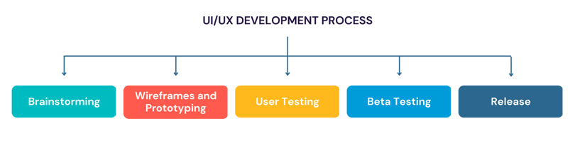
- Brainstorming: The teams started by brainstorming ideas for the new UI design, considering customer feedback and industry trends. They developed multiple concepts and narrowed them down to the most promising ones.
- Wireframes and Prototyping: The UI team then created wireframes and prototypes to visualize the new design and gather feedback from the product and software development teams. They went through several iterations until they had a design that met everyone's needs.
- User Testing: We conducted extensive user testing to gather valuable data on usability, navigation, and user experience. This allowed us to make informed decisions on the design elements that needed improvement, and identified potential roadblocks for users. By doing so, we ensured that our new UI was not only visually appealing but also intuitive and easy to use. Our goal was to create a design that not only looked good but also functioned well and met the needs of our users.
- Beta Testing: Younium also conducted beta testing with a select group of customers to gather feedback on the new UI design. This feedback was used to make further improvements to the design before the final release.
- Release: Once the new UI design was finalized, the teams released it to the public. They ensured the update did not affect any existing functionality that customers were familiar with.
The internal steps taken by the teams ensured that Younium's new UI design was well-designed, functional, and met the needs of its customers. With a cleaner and more modern look, refreshed color palette, and improved functionality, Younium is excited for users to try out the new UI and provide feedback for future improvements.
Color Update: A Touch of Old and New
One of the first changes made in the Younium update was to the color palette. The primary color was changed to a sleek blue, with a touch of the original orange used on some icons and action buttons. This combination of old and new was positively received by many users, who appreciated the nod to the previous version of the software.
Menu Relocation: A More Intuitive Navigation

Another major update was the relocation of the main menu from the top to the left-hand side of the screen. This change was made to improve navigation and make it easier for users to find what they need quickly. The new display of inboxes on the left was also preferred by beta users, who found it faster to monitor conversation volume between multiple inboxes and navigate between them.
Slide-In Panel: More Space for Organizing Information

The right-side card section was transformed into a slide-in panel, creating more space for users to work with tables and making it easier to organize information. This change was made in response to feedback from several customers who needed more table space.
Updated Icons: Clear and Easy to Use
The new icons in the Younium update were updated to ensure everything is easily recognizable, so users can get to work immediately without any confusion. Test users found the updated icons to be clear and easy to use.
Customer Feedback: A Driving Force Behind Design
But don't just take our word for it - our beta testers have given us overwhelmingly positive feedback on these changes. Here are some of their comments:
- "Love the new blue color scheme - it feels much more modern and sleek."
- "The left-hand side main menu is much easier to use than the old top menu."
- "The slide-in panel for the right-side cards is a game-changer - I can finally organize my tables how I want to."
No Loss of Functionality: The Same Great Younium, With a Fresh New Look
Before
After
Younium has ensured that these changes won't affect any of the functionality that users are already familiar with. Customers can still use all of the features they're used to with a brand-new look and feel. Younium is excited for users to try out the new UI and provide feedback as the company continues to improve the software in the future.